1
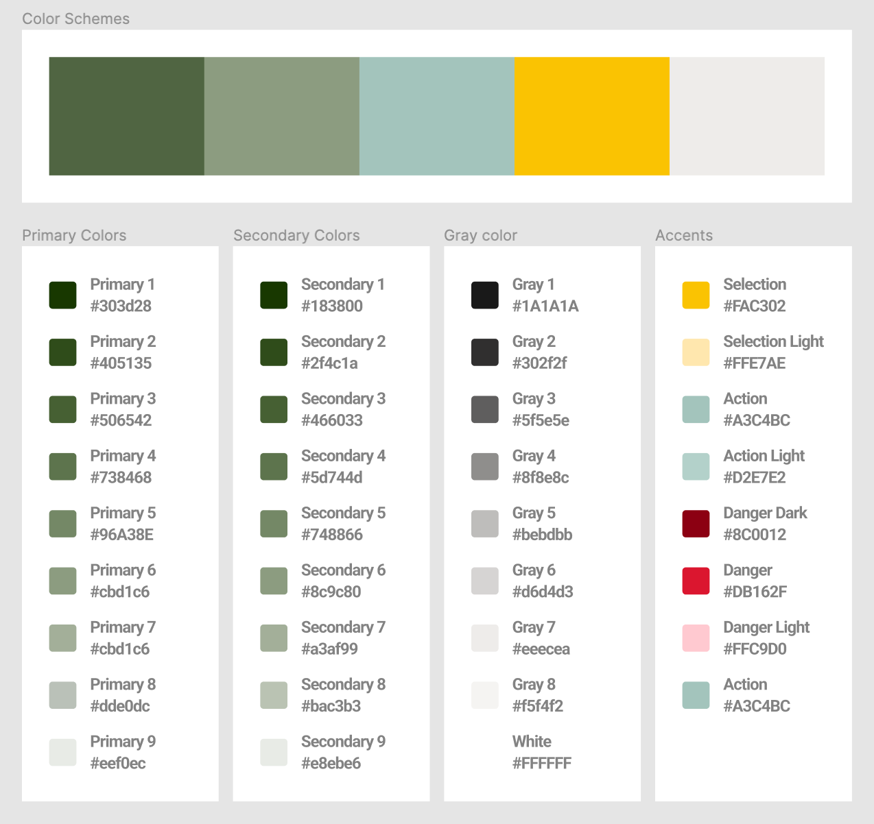
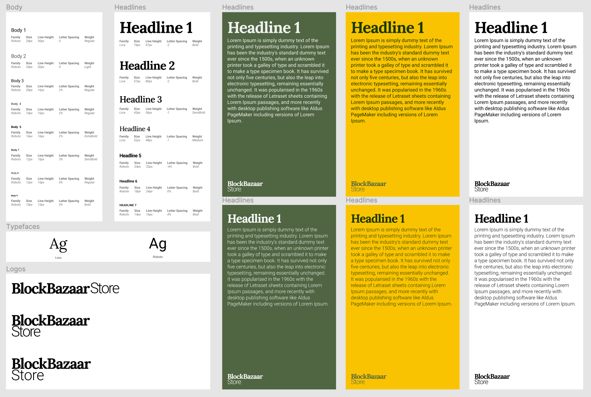
several color scheme were proposed which from all one was selected. The idea behind the color schemes was to convey a mood of calm and adventure and exploration. as part of the design system, typography schema was created to match the color scheme
2
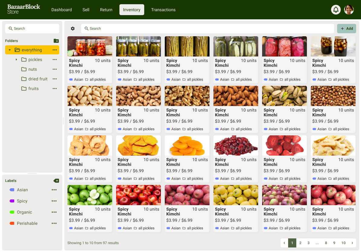
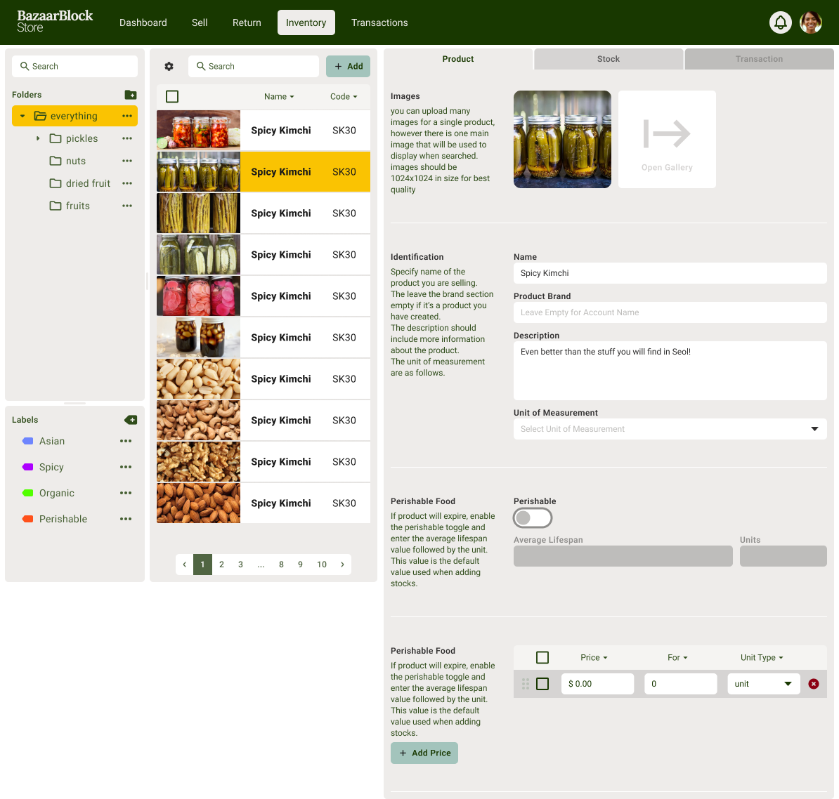
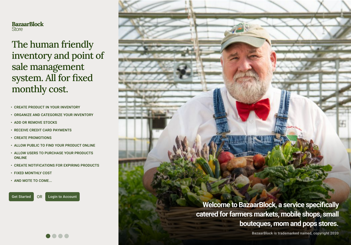
After that we created a few concept mocks to create a mood, and convey how the color and font system would look in an actual application
3
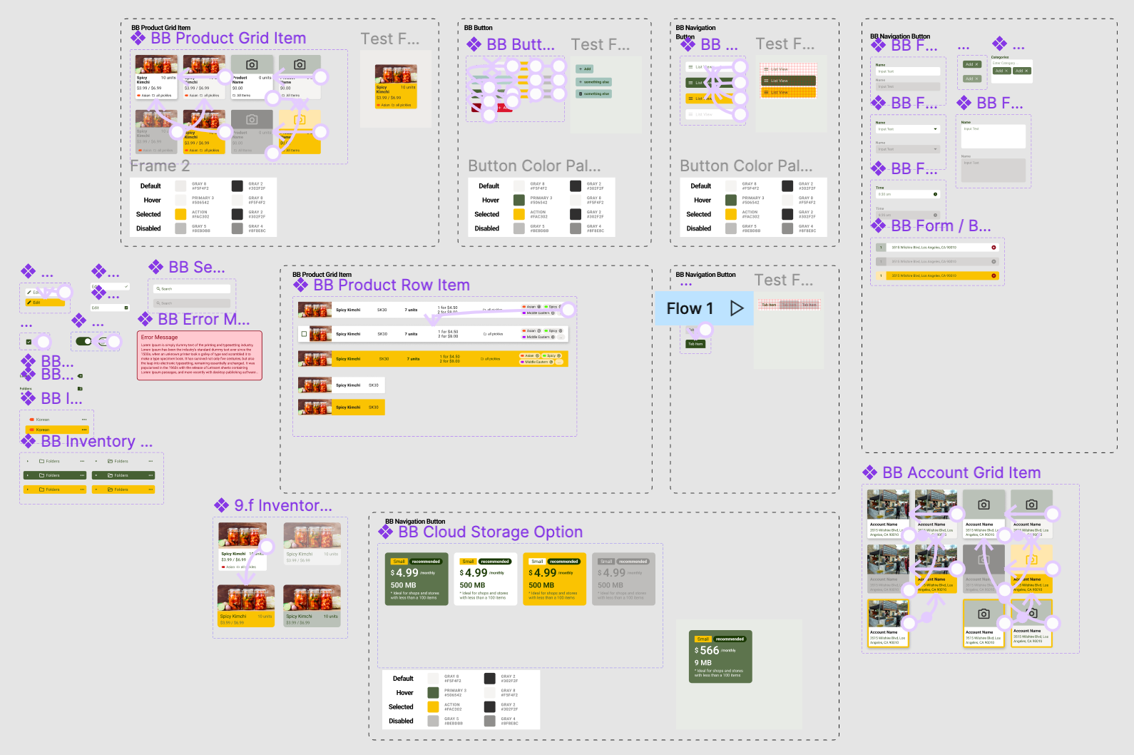
Then we started restructuring our prototype mockups and created a reusable component system, that we could use to create the rest of the views
4
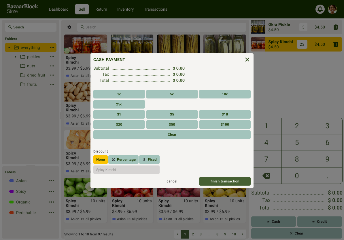
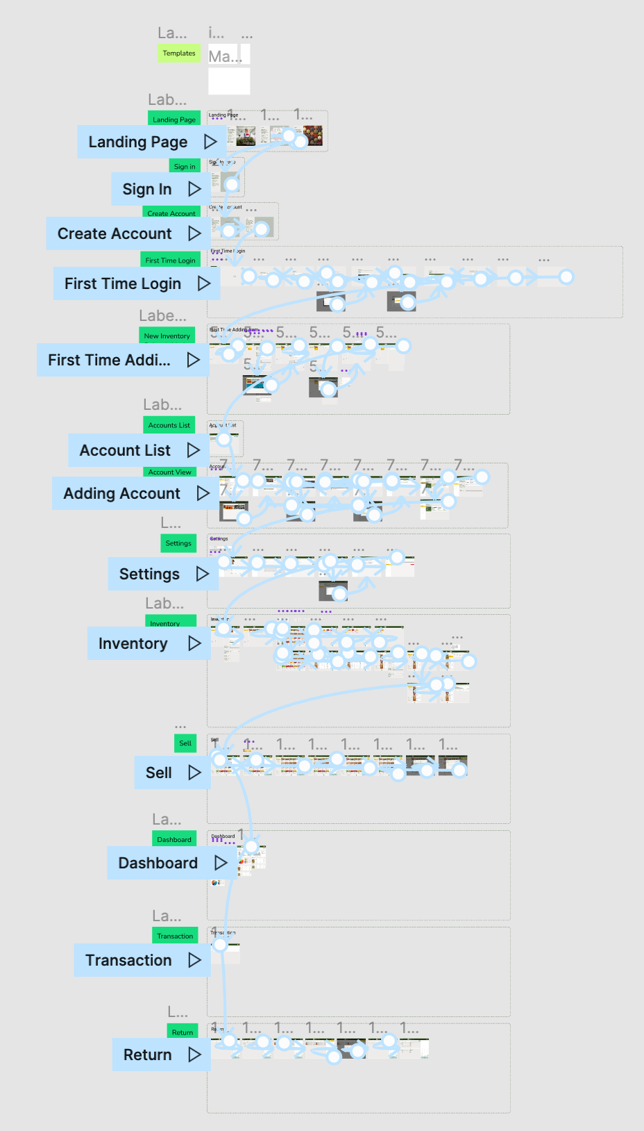
The designs are reviewed and revised, several times with interactions connected. This is a crucial step as this would reveal issues with the workflow and it would expose many missing functions initially not thought of
5
a full end to end video of the interaction is created and ready for developers to start implementing the workflow